The Builder Strategy
A Journey of Sustainability Leadership
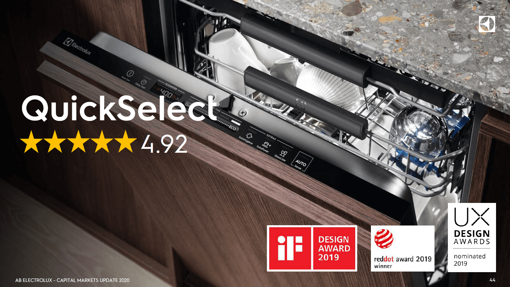
QuickSelect is more than just a dishwasher interface. It became the Sustainability Ambassador for Electrolux, remaining a symbol to this day of how design can drive real change in consumer behavior and industry standards. In an industry often criticized for “greenwashing”, this UI proved that sustainability could be a core product feature rather than just a marketing claim.
- The Recognition: The interface received global acclaim, winning the iF Design Award and Red Dot Award in 2019, and earning a UX Design Awards nomination. These awards honored the influence the design had on inclusive design and user behavior.
- The Impact: It became the centerpiece of Electrolux’s Capital Markets Day - a rare moment where a User Interface was presented to investors as a primary driver of ROI and brand value. The results spoke for themselves: +10% Net Sales and +11% Gross Profit (YTD September 2020, year-over-year vs. previous Electrolux Built-in 60 cm), demonstrating that reducing manufacturing complexity and increasing consumer value are not opposing forces.
- The User Voice: Most importantly, it maintained a consumer rating of 4.7/5 stars for years. This proved a critical point - users don’t just “tolerate” sustainable choices. They embrace them when the complexity is removed.
But this “Hero” status wasn’t the starting goal. It was the outcome of a rigorous journey to solve a deep-seated industry paradox.
Starting Point
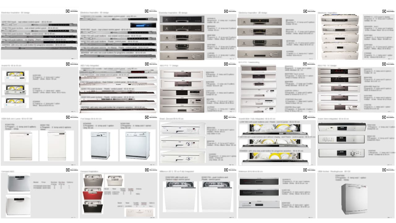
The context behind home appliances is challenging. The industry operates on a strict baseline: “Do the best job for the lowest price”. Innovation is often reduced to a spec-sheet battle, where manufacturers add buttons and programs just to match a competitor’s brochure, while trying to keep the cost under 5 USD.
Over the years, to keep up with this “Button War”, we had accrued a massive debt of complexity. We were managing 15 different electronic boards and over 75 unique UI variations.
The Misconnection
The real issue wasn’t just “cognitive load”. It was a fundamental misconnection regarding the Energy Label. Users believe the Label applies to the entire machine. They think, “I bought an A+++ machine, so every button I press is efficient”. In reality, the label only applies to one specific program (Eco). Every other button they press consumes more energy. Because they didn’t understand this, and because the UI was confusing, users adopted a behavior of Trial and Error. They would try different buttons until they found one that “felt” like it worked - usually a short, hot program that burned resources - completely unaware they were bypassing the sustainability they paid for.
Learning and Connecting the Dots
I realized early on that I couldn’t solve this by just adding another “Eco” button. In a large organization, “having ideas” is easy. Everyone has them, and it often becomes a political game of “who can sell usage.” But that path only leads to more dilution.
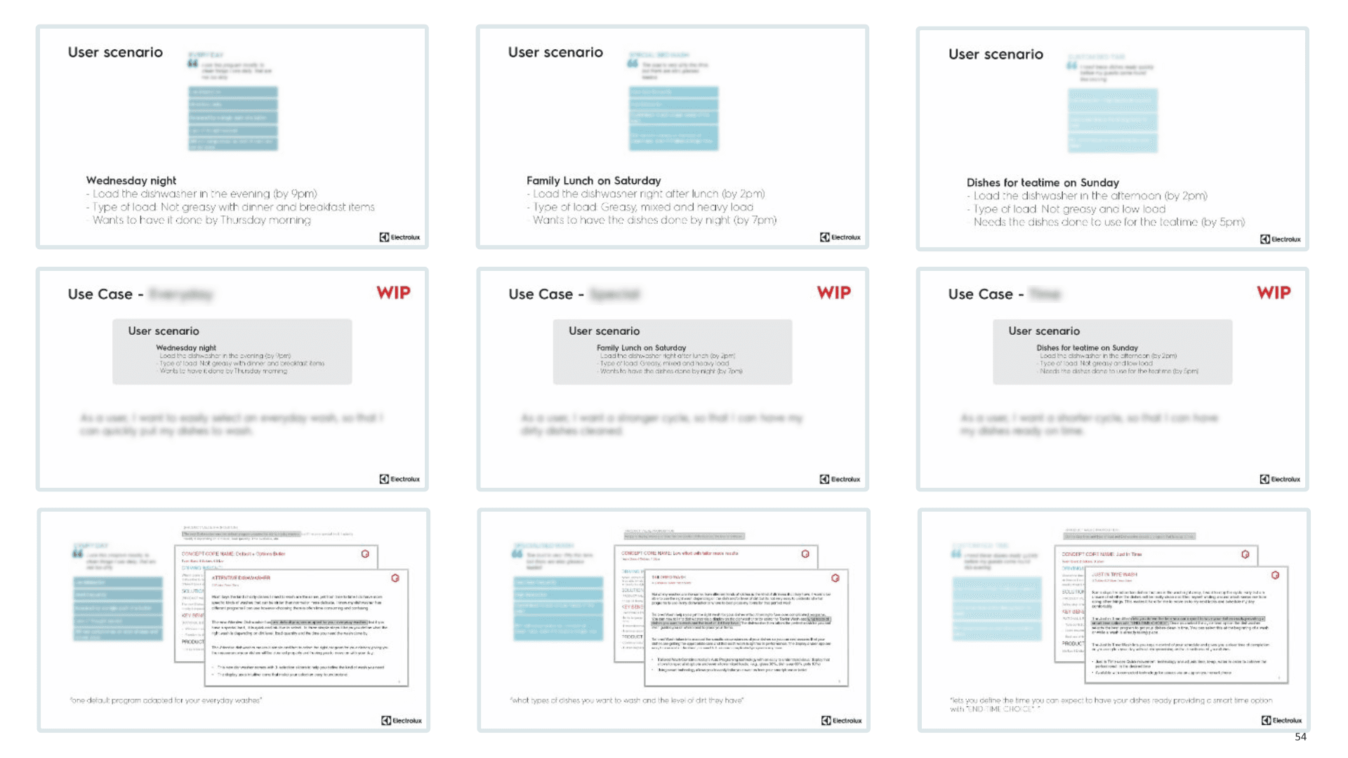
To find the truth, I started an investigation. I analyzed user reports and lab tests. I saw a chaotic landscape: singles, large families, home cooks, daily usage, only weekends, different cuisines, and more. Everyone has a different routine, which affects their result and understanding of the machine. Every idea on the table solved one use case or one pain point - never all of them.
The solution wasn’t in a single idea, but a combination of them all. Not to dilute into an average solution, but to break down every single idea and connect all the dots until we found something that adapted to every scenario.
The Innovation Challenge
There was a huge gap between the user and the machine. The only way to solve it was breaking down both worlds and connecting the common pieces.
By connecting all the dots, the solution that surfaced was so primordial that I understood why it wasn’t done before. At that moment I knew it would be a huge challenge because it was basically playing against the house - challenging the established logic of the entire industry.
Sometimes innovation is not about something that never existed, but bringing it back to basics after things get out of hand. That type of innovation is often the hardest because it can be perceived as going backward. But in reality, it is the only way to break free from the complexity trap and create something that truly resonates with users.
The primordial solution? Time.
The Duality
You might wonder if basing a dishwasher UI on “Time” made the concept too complicated. Here is where the Duality comes in. It was simple and complex at the same time.
- Simple: The whole concept is based on Time - how long a wash takes. Time is a universal metric that everyone understands. It is the currency of our lives.
- Complex: The challenge was how the market would react. Would a simple slider compete with the established mental model where “More Buttons = More Premium”?
I had to counter the Cognitive Load of the user and the Business Needs of the company at the same time. We knew our best bet was not on how “intuitive” the UI was, but how intuitive it was to learn.
The Ecometer Insight
To bridge the gap, I introduced the Ecometer. It wasn’t just a label - it was a nudge. As the user adjusted the Time Slider, the Ecometer reacted instantly. It allowed them to decide: “Do I need speed (Cost) or do I have time (Reward)?” We anticipated their expectations and delivered a solution that finally made sense.
Users had to see it working just once for everything to click. They were no longer clueless about how the machine actually functioned - they could engage with it, challenge it, and make it work for them. The Ecometer made “Time” not just a feature, but a hero. It transformed the experience from a confusing array of buttons into a clear, engaging interaction that empowered users to make informed choices about their energy consumption.
The Voyager
Having the insight was only the beginning. The real challenge was keeping this direction alive in a corporate culture accustomed to feature creep.
As I touched in Expectation Effect part 2, you are not the captain but the navigator. My primary task was to help the team stay on course and not lose focus on the end-user and their needs. I had to listen and adapt to different perspectives while keeping the plan and objective in sight, removing the noise and enabling clean communication.
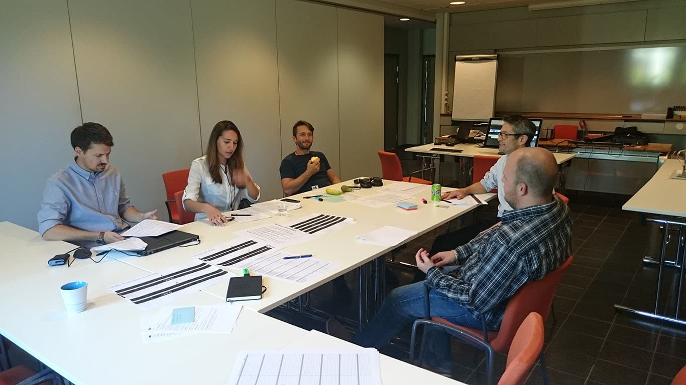
To promote collaboration, I refused to use slide decks. Slides are abstract. They invite opinionated debate where the loudest voice wins. Instead, I established a rhythm of Weekly Prototypes.
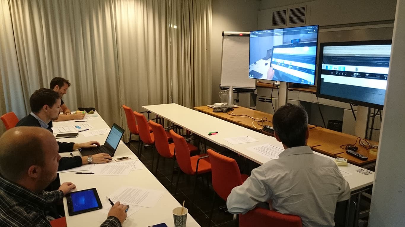
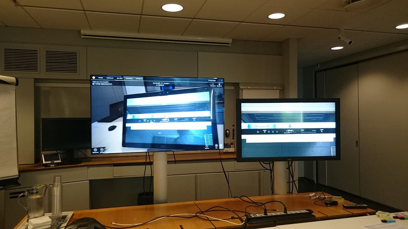
I didn’t use static images. I built 1:1 digital prototypes on a touchscreen, wrapped in Adobe Air, that simulated the real machine - complete with sound and door opening/closing mechanics. This was as close as possible to the real experience, allowing us to gather high-fidelity user insights across several rounds of testing.
- Common Understanding: This eliminated the “abstract” debate. We weren’t arguing about a “concept” - we were discussing a working product.
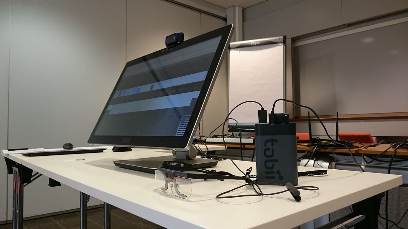
- Validation: In separate user tests, we used Eye Tracking on these prototypes. We watched users struggle with the old UI, and then we watched their eyes light up when they interacted with the Ecometer. They didn’t need an explanation. They felt the trade-off.
The Success
The journey from “75 confused variations” to “One Hero Interface” wasn’t magic. It was a strategy of Builder Leadership.
I wasn’t “engineering” a relationship - I was fixing a broken UI. By connecting the dots between the User’s constraint (Time) and the Machine’s logic (Efficiency), we normalized sustainability. QuickSelect proved that you don’t need to choose between Business Goals and Sustainability. When you strip away the complexity and nudge the user with transparency, the product naturally becomes a hero.