Dometic Design System
A universal design system for a global mobile living brand.
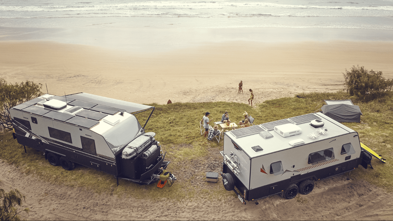
Dometic is a global pioneer in mobile living, marine, residential, and professional outdoor solutions. Operating across AMER, EMEA, and APAC regions, the company produces everything from physical hardware (RV air conditioners, mobile cooling systems, marine steering controls) to complex digital platforms.
To bring cohesion to this vast ecosystem, Dometic required a design language that went beyond traditional web-based UI kits. The result is a universal design system structured to scale across web, mobile apps, embedded screen interfaces, and physical hardware interfaces.
This case study focuses on the high-level architecture and strategic alignment of the Dometic design system. For a detailed engineering breakdown of the automated translation pipeline, explore the Design to Code case study.
Defining the Baseline
Before defining the design language, we established a clear baseline of Dometic’s brand architecture, physical product ecosystem, and distinct user personas.
The Universal Challenge
Creating a design system for a global, multi-domain brand like Dometic presents a unique set of challenges that standard web design systems cannot address:
- Cross-Platform Software Fragmentation: The design system must support standard web platforms (React, Tailwind), native mobile apps (React Native, iOS, Android), and hardware-embedded interfaces (C++, Qt, LVGL, Python, HTML).
- Physical-to-Digital Harmony: The visual language must bridge the gap between digital screen layouts and physical product manufacturing. Design decisions must translate seamlessly to paint finishes, physical button labeling, and product branding.
- Global and Regional Diversity: With distinct markets in North America, Europe, and Asia-Pacific, the system must accommodate localized product requirements, safety regulations, and translation constraints while maintaining a unified global identity.
- Multi Brand Cohesion: Dometic’s portfolio includes multiple sub-brands (Dometic, Waeco, IGLOO, etc.) that require a shared design language while allowing for individual brand expression.
- Evolving Product Ecosystem: The design system must be flexible enough to adapt to new product categories, emerging technologies, and evolving user needs across the mobile living landscape.
- Multi-environment support: Land vs Marine, Consumer vs Professional, Outside vs Inside, Outdoors vs Residential, etc. Each environment has unique user needs, safety requirements, and design constraints that must be addressed within the same system.
- Compact Development Teams: With a lean design and engineering team, the system must be efficient to maintain and easy for cross-functional teams to adopt without extensive training or overhead.
The User Ecosystem
We categorized Dometic’s user base into three primary profiles, mapping their touchpoints across the hardware-to-software lifecycle:
-
Consumer (B2C): Direct or indirect (through retailers) customers of Dometic products, such as RV owners, boaters, outdoor enthusiasts, and residential users. They interact with Dometic through mobile apps, product interfaces, and customer support channels.
-
Customer (B2B): Businesses that purchase Dometic products for commercial use, such as fleet operators, hospitality providers, and outdoor retailers. Similar to B2C users, they interact with Dometic through product interfaces tailored for both consumer and commercial applications.
-
Employee (B2E): Dometic’s internal teams, including design, engineering, and marketing. They use the design system to create and maintain Dometic’s digital and physical products, ensuring brand consistency and efficient development processes.
The Context

Dometic’s products are used in a wide range of contexts, from the interior of an RV to the helm of a boat, from a mobile app on a smartphone to a physical product in a workshop. Each context has its own unique requirements and constraints that must be considered when designing the system.
However, besides the location and usage, the intent is another very important aspect to consider. For example, a user may interact with a product while in motion (driving, boating, etc.) or while stationary (at home, in a workshop, etc.). This context of use has a significant impact on the design decisions, such as the size of the buttons, the contrast of the colors, and the amount of information displayed.
The Platforms
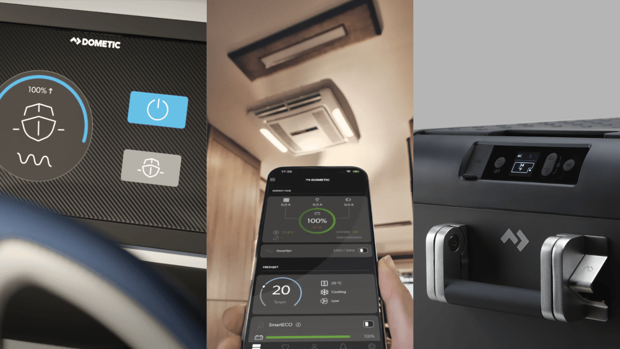
- Web: focused on system dashboards and web applications used to monitor and control physical products rather than public-facing marketing pages. The system supports raw HTML, React, and Tailwind CSS configuration.
- Mobile: native iOS and Android apps alongside cross-platform React Native apps. The design system supports mobile-specific patterns, high-fidelity touch targets, and responsive sizing across varied screen densities.
- Embedded: dedicated on-device screens running C++, Qt, LVGL, Python, or lightweight HTML. These interfaces operate under tight processing, memory, and resolution constraints, requiring highly optimized layout rendering and asset delivery.
The Golden Rules
Due to the high complexity required to create a universal design system, we defined a set of golden rules that guided our design decisions and helped us maintain focus on the core principles of the system:
-
Context Aware: the context is directly connected to how the products will be used and defines how the user will interact with the products or systems.
-
Agnostic: the design system should be agnostic to the platform, technology, or environment it is being used in. It should be flexible enough to adapt to different use cases and requirements without losing its core identity.
-
Modular: the design system should be modular and scalable, allowing for easy updates and additions as the product ecosystem evolves. It should be built on a foundation of reusable design particles that can be combined in various ways to create consistent user interfaces across all platforms.
-
High Contrast: the design system should prioritize high contrast and accessibility to ensure that all users can easily read and interact with the products, regardless of their environment or lighting conditions.
System Blocks
Design Particles: The Single Source of Truth
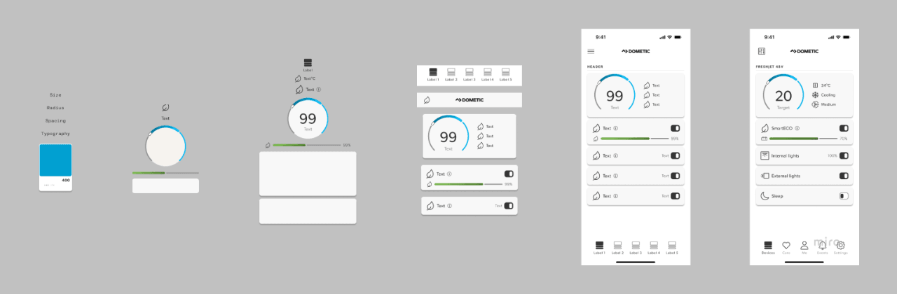
At the scale of Dometic, sharing code-level components (such as a React button) is impossible across all environments. A C++ marine dashboard cannot render a React component.
To solve this, the Dometic design system shifts its primary focus from components to design particles (primitives and design tokens). Primitives represent the foundational design choices:
- Color Primitives: Raw brand hex codes and functional colors.
- Spacing & Grid Primitives: Layout spacing values, padding units, and aspect ratios.
- Typography Primitives: Font families, font weights, and line-height scale values.
- Geometry Primitives: Border radii and elevation shadow values.
The Token Translation Pipeline
These design particles are defined as platform-agnostic JSON or YAML configurations. A build pipeline compiles these tokens into format-specific assets for engineering teams:
- Web Target: Compiles to Tailwind CSS configuration tokens and CSS custom properties.
- Mobile Target: Compiles to Swift color assets and Kotlin styling classes.
- Embedded Target: Compiles to C++ header files and Qt QML values for HMI screens.
- Physical Product Target: Maps to NCS color references for industrial designers and manufacturers.
By treating design decisions as raw particles, Dometic maintains absolute brand alignment from a marine steering dashboard to a mobile climate-control app and the physical product branding.
Colors
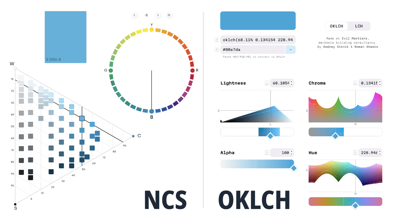
Dometic colors are based on the NCS (Natural Color System) rooted on how humans perceive colors in the physical world. It is best to create visual balance across different colors. The NCS color system is based on four color components: blackness, chromaticness, hue, and whiteness.
To align with Digital colors, we chose to use the OKLCH color space, which is a perceptually uniform color space that allows us to maintain consistent lightness and chroma across different hues. This ensures that our colors look balanced and harmonious across all platforms, from digital screens to physical products.
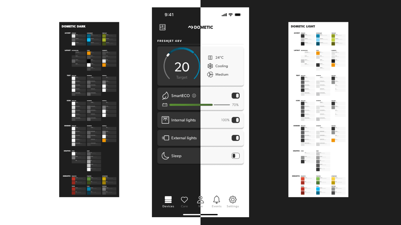
Although translating NCS to OKLCH is complex, instead of chasing the perfect translation, the goal is to facilitate the communication around the colors. By using a common color space, we can ensure that our design decisions are consistent and aligned across all platforms, while still maintaining the unique characteristics of the NCS color system.
Iconography
Iconography is the most visible thread running through the Dometic ecosystem. While seemingly straightforward, the library must solve distinct physical constraints: from pixel-perfect legibility on low-resolution monochrome hardware screens to minimum line-weights optimized for high-durability industrial printing on physical control panels.
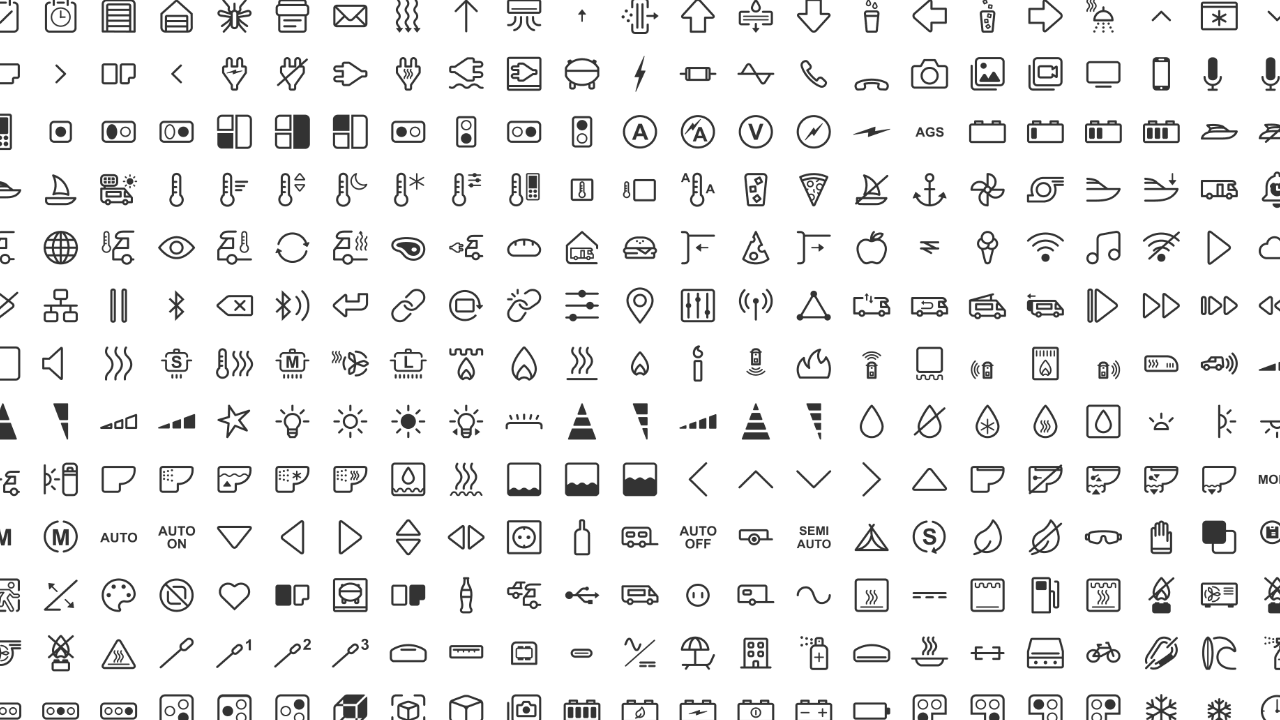
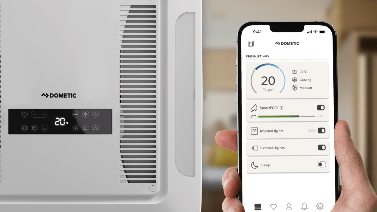
All icons follow ISO and IEC standards whenever possible, while also relying on common iconography patterns and metaphors to ensure that they are easily recognizable and understandable across different cultures and regions.
Typography
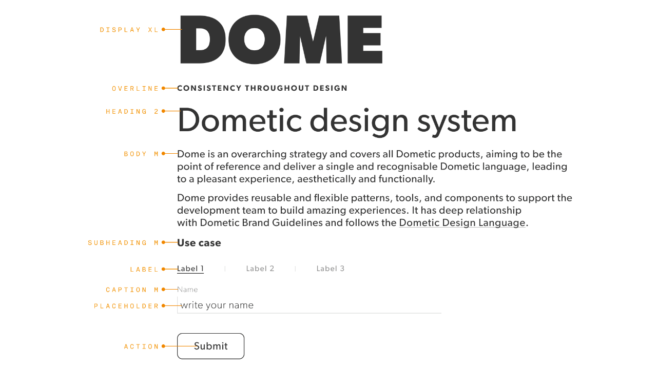
While typography lacks the graphic complexity of iconography, it faces severe environmental and system constraints. On physical hardware, typefaces must remain legible under direct sunlight, marine glare, and varying reading distances. Digitally, the system must balance custom branding with fallback strategies for localized languages and low-footprint embedded environments.
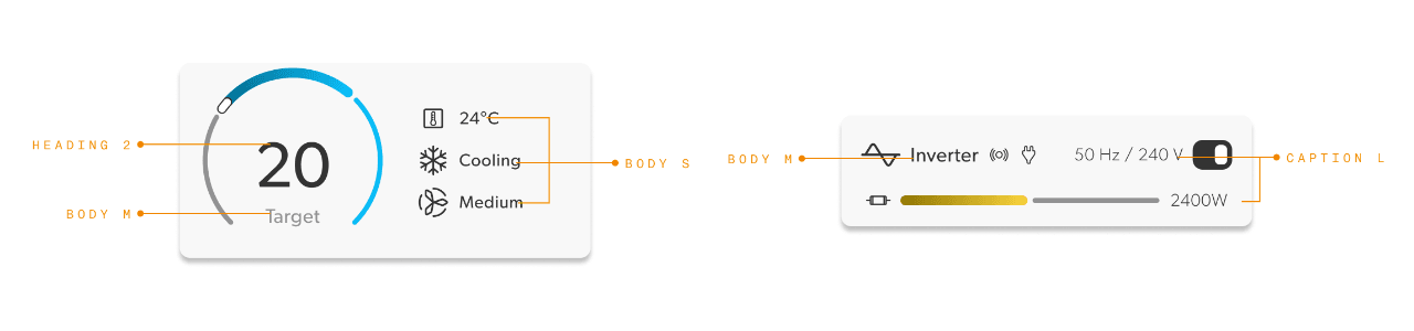
Styling and scaling are also important considerations for typography, as the design system needs to ensure that text is legible and readable across different platforms and devices. This includes defining a clear hierarchy of font sizes, weights, and styles that can be applied consistently across all products.
Components
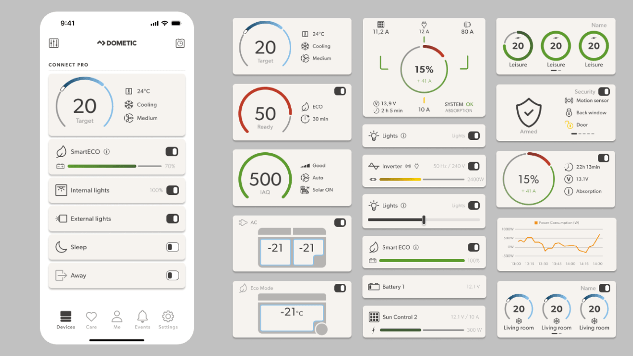
Components are the embodiment of the design system’s design decisions, but they are not the single source of truth. They are built on top of the design particles and are meant to be used as a reference for engineering teams when building their own platform-specific implementations.
To keep the design language consistent we rely on the semantics of the components, rather than their specific implementation. A component may have different visual styles and interactions on web, mobile, and embedded platforms, but they all share the same underlying design decisions and principles, while maintaining consistency in their behavior and functionality.
Scaling
To handle the great amount of screen sizes and resolutions, spanning from small 1.5” embedded screens to 32” marine dashboards, we rely on a major second scaling system that allows us to maintain a consistent visual rhythm and hierarchy across all platforms. This scaling system is based on a modular scale that defines a set of predefined size values that can be applied consistently across all products.
Scaling is not only important for visual consistency, but also for accessibility and usability. By defining a clear hierarchy of size values, we can ensure that our products are easy to read and interact with, regardless of the platform or device. The context of use is also considered where certain products may require larger or smaller size values based on their intended use and user needs, with “in motion” or stationary products being a good example.
Bridging the Gap
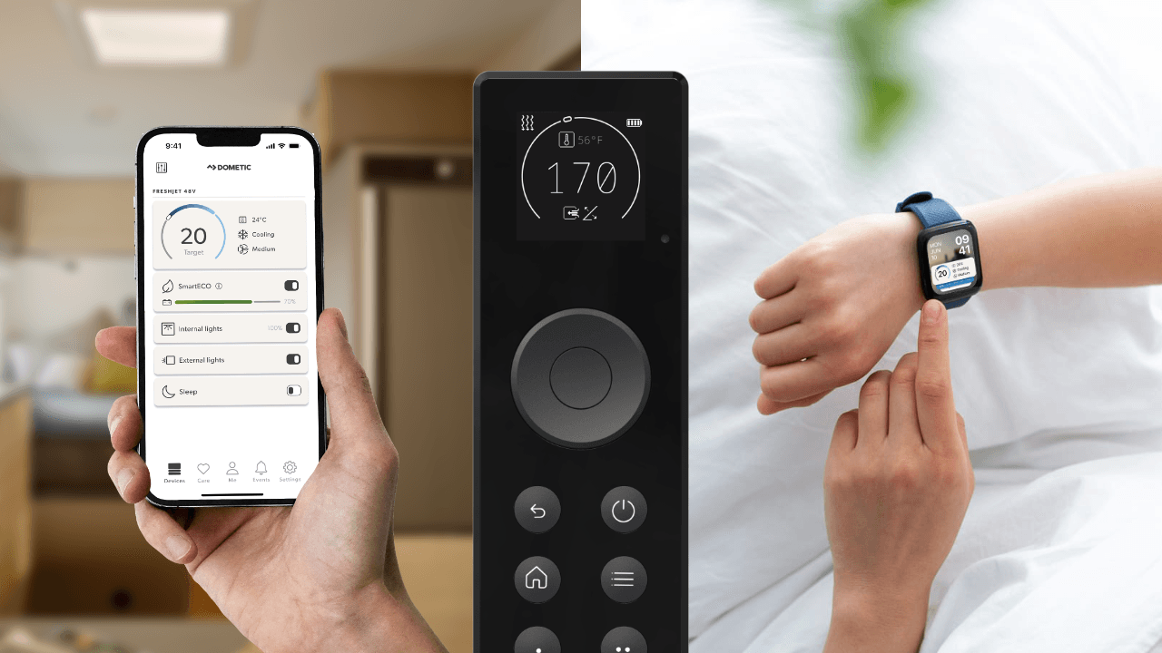
This is only the tip of the iceberg when it comes to the Dometic design system, but it serves as a foundation for creating a cohesive and scalable design language that can adapt to the unique challenges of a global mobile living brand.
The Dometic design system is not just a collection of design decisions, but also a framework for bridging the gap between digital and physical product design. This involves close collaboration between designers, engineers, and industrial designers to ensure that the design system’s principles are applied consistently across all products, from digital interfaces to physical hardware.
Read more about Design to Code: the process of translating design decisions into code-level components and assets.